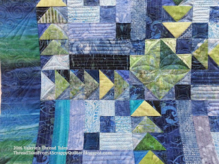
This quilt has very blended color choices and when Sally and I first talked about this one, she thought she wanted an allover design and I agreed. Sometimes those deep, mottled colors won’t show thread and detailed quilting is lost. An allover can be prettier in most of those situations and provide more quilting that a light custom. But when this one came up the line to it’s day for quilting, those beautiful points and cornerstone designs just jumped at me begging to be played up. So, I grabbed my acrylic panel and started doodling.
I drew out a plan that I was happy with that ran continuously with lots of detail yet allowed me to stitch most of this without the added expense of everything needing to be stitched in the ditch. Most of this is completely freehand with a template only used for that 8 point petal center design. Sally agreed, we had to try this!
I was so happy that the texture did translate to the fabric! Look at those beautiful points and all that piecing detail in this quilt that is now showcased. Plus its not so dense that it is stiff, it is still very soft and snuggle as this is a bed quilt. I will say that I have been disappointed a few times. When we draw, we of course have a high contrast marker, the line is thicker than any thread we use and it just doesn’t always translate as beautifully as what is on the acrylic pad.
Plus, this fun border! I don’t think I have a picture of the backing, it was a little deeper than the outer border and blended coloring as well. The pattern is a Debbie Caffrey or Charlotte Angotti classroom project if you are wondering what the pattern is.


